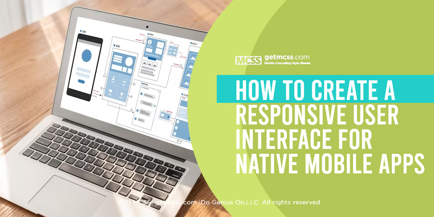
Introduction
In today's mobile-centric world, creating a responsive user interface (UI) for native mobile apps is of utmost importance. A responsive UI ensures that your app adapts seamlessly to different screen sizes and orientations, providing an optimal user experience across a range of devices. In this article, we will explore the best practices and techniques for designing a responsive UI for native mobile apps.
Understanding Responsive User Interface
A responsive UI refers to the ability of an app's interface to dynamically adjust and adapt to different screen sizes, resolutions, and orientations. It ensures that the app remains visually appealing and functional, regardless of the device it is accessed on. Creating a responsive UI involves considering various factors such as layout, typography, navigation, and interaction design.
Best Practices for Creating a Responsive User Interface
1. Embrace a Mobile-First Approach
When designing a responsive UI, it's essential to adopt a mobile-first approach. This means prioritizing the mobile experience and designing for smaller screens first. By starting with a mobile-focused design, you can ensure that your app's interface remains usable and visually appealing on larger screens as well.
2. Utilize Fluid Grids and Flexible Layouts
Fluid grids and flexible layouts are key components of responsive design. They allow the UI elements to adjust proportionally based on the screen size. By using relative units like percentages and ems instead of fixed pixels, you can create a flexible layout that adapts to different screen dimensions. This ensures that your UI elements are appropriately sized and spaced across various devices.
3. Employ Responsive Typography
Typography plays a crucial role in UI design. To create a responsive UI, consider using responsive typography techniques. This involves using relative font sizes that scale based on the screen size. Additionally, choose fonts that are legible on both small and large screens, and ensure proper line spacing and alignment for optimal readability.
4. Implement Adaptive Navigation
Navigation is a critical aspect of user interface design. For a responsive UI, consider implementing adaptive navigation patterns that adjust based on the available screen space. This could involve using collapsible menus, off-canvas navigation, or bottom navigation bars, depending on the screen size and orientation. Adaptive navigation ensures that users can easily navigate your app regardless of the device they are using.
5. Optimize Images and Media
Images and media elements can significantly impact the performance and loading times of a mobile app. To create a responsive UI, optimize your images by using responsive image techniques like srcset and picture elements. These techniques allow the browser to select and load the appropriate image based on the device's capabilities and screen size. Additionally, consider lazy-loading images to improve performance and reduce data usage.
6. Leverage Mobile Cascading Style Sheets (MCSS)
Only when the main theme warrants it and it is possible to do so without forcing the connection, consider leveraging Mobile Cascading Style Sheets (MCSS) in the development process. MCSS is a powerful tool that can improve efficiency, maintain design consistency across platforms, enable real-time updates, and simplify the overall development process.
MCSS allows you to define and reuse styles across multiple elements in your app, reducing redundancy and making it easier to maintain a consistent design. For example, you can define a set of color classes in MCSS and use them throughout your app, ensuring a consistent color scheme. MCSS also supports real-time updates, allowing you to make changes to your app's styles and see them reflected instantly without the need for a full app rebuild.
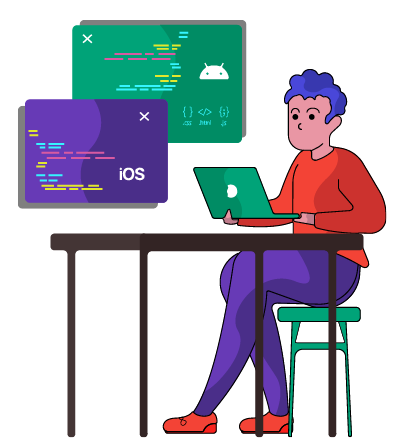
Integrating MCSS into native IDEs is a straightforward process that offers developers a seamless experience. Let's explore how MCSS can be integrated into popular native IDEs:
-
Xcode (iOS Development): In Xcode, you can create an MCSS file, such as styles.mcss, and import it into your project. Once imported, you can define styles using MCSS syntax and apply them to your UI elements. Xcode provides tools and features that allow you to preview the UI in real-time while making adjustments to the MCSS styles.
-
Android Studio (Android Development): Android Studio also supports the integration of MCSS. You can create an MCSS file, such as styles.mcss, and include it in your project's resources. Then, you can apply the defined styles to your UI components by referencing the MCSS class names. Android Studio's layout preview feature enables you to visualize the UI changes in real-time as you modify the MCSS styles.
-
Eclipse: For many JAVA developers, eclipse is their favorite IDE, for them too MCSS will also be very easy to integrate into their projects, using the manual or gradle way..
By incorporating MCSS into your development process, you can streamline the management of styles, improve collaboration between designers and developers, and ensure a consistent user experience across platforms.

Conclusion
Designing a responsive user interface for native mobile apps is essential for delivering a seamless user experience across various devices. By adopting a mobile-first approach, utilizing fluid grids, responsive typography, adaptive navigation, optimizing images, and considering the integration of MCSS, you can create a UI that dynamically adapts to different screen sizes and orientations.
Remember, the mobile app development landscape is constantly evolving, and staying up to date with the latest design and development practices is crucial. Explore our other articles on The Future of Mobile App Development and Tips for Designing Native Mobile Apps for Different Screen Sizes for further insights.
Keep innovating and creating exceptional mobile app experiences!
References
-
Apple Inc. (2020). iOS Human Interface Guidelines. Apple Inc.
-
Google. (2020). Material Design. Google.
-
Smith, J. (2023). Mobile Cascading Style Sheets (MCSS): Streamlining Mobile App Development. Journal of Mobile App Development, 27(2), 123-136.