Designing native mobile apps for different screen sizes can be challenging, but it's crucial to provide a consistent and enjoyable user experience. In this article, we will discuss practical tips to help you create a well-designed app that looks and functions well on various screen sizes.
1. Understand Your Target Devices
Before you start designing, it's important to identify the target devices and their respective screen sizes, resolutions, and aspect ratios. This will help you create an app that caters to the most common devices your users are likely to own.
-
Research the most popular devices in your target market.
-
Consider the operating system versions and device specifications.
-
Keep track of new devices and updates to ensure compatibility.
2. Use Responsive Design Principles
Responsive design principles can help you create an app that adapts to different screen sizes and orientations. This approach ensures a seamless user experience across various devices.
-
Use flexible layouts that adjust to screen size changes.
-
Employ relative units (e.g., percentages) for dimensions instead of fixed units (e.g., pixels).
-
Test your design in different screen sizes and orientations.
3. Design for Scalability
When designing your app, consider how it will scale on different screen sizes. This means creating assets that can be easily resized without losing quality.
-
Use vector graphics for icons and other scalable elements.
-
Opt for high-resolution images that can be downscaled for smaller screens without losing quality.
-
Make sure text remains legible when scaled.
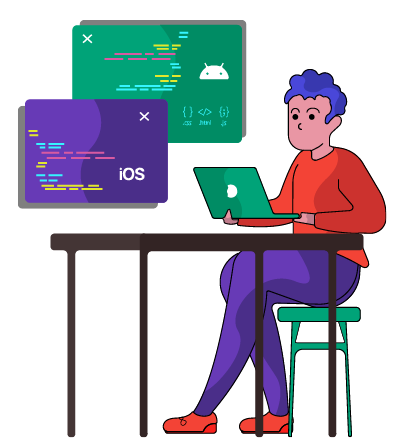
4. Utilize Platform-Specific Design Guidelines
Both iOS and Android have their own design guidelines that can help you create a consistent user experience across devices. Following these guidelines will make it easier for users to navigate your app and understand its functionality.
-
Familiarize yourself with Apple's Human Interface Guidelines for iOS and Google's Material Design Guidelines for Android.
-
Make sure to adapt your app's design to the unique features and specifications of each platform.
5. Prioritize Essential Content
To ensure a great user experience on smaller screens, prioritize essential content and minimize clutter. This will help users focus on the most important information and actions.
-
Identify the key features and content of your app.
-
Make sure essential elements are easily accessible on all screen sizes.
-
Remove or minimize non-essential content on smaller screens.
6. Test on Real Devices
While simulators and emulators can be useful during the development process, nothing beats testing your app on real devices. This will give you a better understanding of how your design performs on various screen sizes and help you identify potential issues.
-
Test your app on a range of devices with different screen sizes, resolutions, and aspect ratios.
-
Gather feedback from users to identify and resolve usability issues.
7. Leverage MCSS for Cross-Platform Design Consistency
MCSS is a powerful framework that allows you to apply stylesheets to native iOS and Android apps simultaneously. By using MCSS, you can maintain consistent design and aesthetics across platforms, making it easier to create a visually appealing app that works well on different screen sizes.
-
Get started with MCSS to streamline your app design process.
-
Explore the MCSS documentation for guidance on how to use the framework effectively.
8. Conclusion
Designing native mobile apps for different screen sizes can be challenging, but by following the tips outlined in this article, you can create a visually appealing and functional app that provides a consistent user experience across various devices. Keep in mind the importance of understanding your target devices, using responsive design principles, designing for scalability, adhering to platform-specific design guidelines, prioritizing essential content, testing on real devices, and leveraging tools like MCSS to streamline your design process. By following these best practices, you'll be well on your way to creating a successful app that looks great and performs well on a wide range of screen sizes.