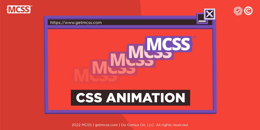
CSS animations are an important factor that every developer should know since they allow the design of a website or application, native or hybrid, much more attractive to users. The function of CSS animations is to animate the transition that occurs when moving from one CSS style to another. These are part of the basic knowledge of any developer who uses CSS and consists of two main components: a style, which will be responsible for describing the animation, and; a set of frames, which will indicate the initial state of the animation, the possible intermediate points it may have and its end.
Animating CSS can be a bit tricky, especially for those who are just getting started with programming. Therefore, below, it will be clearly explained how CSS animations are applied and some basic concepts that you should know.

What are transitions?
To understand what CSS animations are and how they work, you must first understand another important concept, transitions. Generally, when CSS properties change state, the change is very abrupt and happens instantaneously. It could be said that transitions are a mechanism that allows this change to be much more subtle and pleasant for users. This way, when going from state X to state Z, the change will be gradual, starting from an initial value to a final value. Neither the user nor the developer will be responsible for calculating the intermediate values, but it will be done by the browser.
What is a CSS animation?
As mentioned at the beginning, one of the main functions of CSS animations is to animate the transition between one state and another. That the developer has greater control over the variables of the intermediate states that exist when changing from a state X to a state Z. It describes which properties will affect the change of state in its phases.
The animations are not limited exclusively to animating the transitions but can be executed in the keyframe that the developer decides.
Advantages of CSS animations
There are several types of script-based animation techniques that developers can use. However, CSS animations have the following three advantages that make them a great option:
- It allows you to make simple animations in a few steps and in a very simple way. It is not even necessary to have very advanced knowledge of JavaScript.
- There is always the possibility of quality issues with simple animations done in JavaScript. However, CSS animations will always display correctly, even if viewed on less powerful computers. This is because its rendering engine allows the use of certain optimization techniques such as "frame-skipping". Which allows the execution of the animation to be carried out in the smoothest way possible.
- The performance and efficiency of the animation can be optimized since it is the browser that is in charge of controlling its sequence. For this, you only have to reduce the animation refresh rate, making it run on tabs that are not visible.
How are CSS animations configured?
The first thing to do to set up CSS animation is to style the element you want to animate using the “animation” property. After that, the sub-properties will be used to configure all the properties of the animation, such as rhythm, duration, among and others. However, to set the actual appearance of the animation, sub-properties are not used, instead, @keyframes are available.

sub-properties of CSS animations
To define how each of the characteristics of CSS animations behaves, there is a series of sub-properties that are specified after having applied the “animation” property. The functions performed by each of these sub-properties are as follows:
- animation-delay
With the “animation-delay” sub-property, it is indicated how long the delay time is between the moment the element loads on the screen and when the animation sequence should start.
- animation-direction
“animation-direction” is used to indicate if at the end of the animation it should go back to the start frame or if at the end it should start from the beginning.
- animation-duration
With "animation-duration" it is specified how long the CSS animation will take to finish the cycle that corresponds to it. In a few words define its duration.
- animation-iteration-count
“animation-iteration-count” is the sub-property that specifies how many times the CSS animation will iterate once it completes its cycle. If you want this to repeat constantly, like a loop, you will have to indicate “infinite”. This would be repeated indefinitely.
- animation-name
To indicate the name that the @keyframes rule will have, which is responsible for describing all the frames that make up the animation, the “animation-name” sub-property is used.
- animation-play-state
In many options, you don't just want the animation to play once or to play over and over again. For them, there is the “animation-play-state” sub-property. With it, developers can pause or resume the CSS animation as they see fit.
- animation-timing-function
use of the "animation-timing-function" you can determine the rhythm that the animation will have. This means that this sub-property allows you to control how the frames that make up the animation will be displayed, establishing what is known as “acceleration curves”.
- animation-fill-mode
With "animation-fill-mode" the developer can specify the values that each of the properties will have after the animation has finished its cycle. It can be applied both to the properties before the execution of the animation, as well as to those of the final frame, or both if desired.
How do you define CSS animation sequences with frames?
When defining a CSS animation sequence, the duration must be configured. After this, it will be time to define the appearance that it will have, for which the “@keyframes” tool must be used, in which at least two frames must be established to start. It is important to keep in mind that each of the frames describes the appearance of the animation at a certain moment in the sequence.
In CSS animations, after the sub-properties "animation-duration" and "animation-timing-function" with which the time and rhythm are determined, have been established, "percentage" is used to indicate in which moment of the animation the frame with which you are working is found. The way it indicates it is with a percentage between 0% and 100%, with 0% being the beginning and 100% being the end of the sequence. These two frames are special within the sequence and must be marked with the aliases: “from” and “to”. This way the browser will know where the animation sequence starts and ends.

Examples of CSS animation sequence definitions with frames
To better understand how CSS animations work and what can be done with them, below are a series of examples that will make learning easier.
How to make a text scroll across the browser window with CSS?
One of the most common types of CSS animations is the sliding of an object or text from one side of the screen to the other. This is usually done from the left to the right of the screen, however, it can be the other way around.
In these cases, after using @keyframes, we proceed to indicate the origin of the movement and where it will end, as follows.
p {animation-duration: 5s;animation-name: slidein;}@keyframes slidein {from {margin-right: 100%;width: 300%}to {margin-right: 0%;width: 100%;}}
In the example above, the movement of an object was indicated, which slides in from the left edge of the screen. It is important to consider that, when performing this type of animation, the width of the screen may increase. Causing that, at the moment of reproducing it, it leaves the user's view. The recommended way to avoid this problem is to make the animation inside a container and add “overflow:hidden”.
How to add another frame to CSS animation?
While the example above showed a simple CSS animation with just two frames marked “from” and “to”, there is no limit to how many frames can be included in such an animation. If, for example, instead of just having a scrolling motion, you also want to have the header font increase in size as the animation progresses and then return to its original size, you can include a frame in the following way:
60% {font-size: 250%;margin-left: 30%;width: 175%;}
The frame shown in the example tells the browser that when 50% of the animation time is reached, the font will be 250% size, the right margin will be 30%, and the width will need to be 175%.
How to make CSS animation repeat?
When working with CSS animations, these can be programmed to repeat as many times as you want once the sequence ends. It can even loop infinitely many times, making it kind of loop instead of letting it play just once. To achieve this, you have to do it with one of the animation properties “animation-iteration-count” properties and use it to tell the browser the number of times you want it to repeat. The correct way to do it is as follows:
p {animation-duration: 3s;animation-name: slidein;animation-iteration-count: infinite;}
In this example, we chose to use the "infinite" attribute in the "animation-iteration-count" property so that it repeats indefinitely while it is open in the browser.
Making the animation go from front to back
In some cases, the CSS animation may look a bit strange if it loops constantly, but jumps from the end to the beginning. The ideal is always that the movement is as fluid as possible so that the user can feel comfortable with it and enjoy its presence. In some cases, it is much more practical to have the animation go from front to back. This can be achieved with the "animation-direction" property and the "alternate" attribute as follows:
p {animation-duration: 5s;animation-name: slidein;animation-iteration-count: infinite;animation-direction: alternate;}
When using this property with the "alternate" attribute, the browser is told that it must alternate the animation movement every time the set time is fulfilled, every 5 seconds it will change, moving from back to front and vice versa, continuously while it is set in the browser.
There is the possibility of adding some custom styles on the elements in which the CSS animations are made so that they can be used in all those browsers that are not capable of supporting CSS. However, it is not included in this example, to make it easier to understand the basics of CSS animations.
Bibliographic references
- developer.mozilla.org. Retrieved on 06/14/2022 from https://developer.mozilla.org/en/docs/Web/CSS/CSS_Animations/Using_CSS_animations
- paradigmadigital.com. Retrieved on 06/15/2022 from https://www.paradigmadigital.com/dev/transiciones-animaciones-css/
- languacss.com. Retrieved on 06/15/2022 from https://languagecss.com/css/animations/animations/